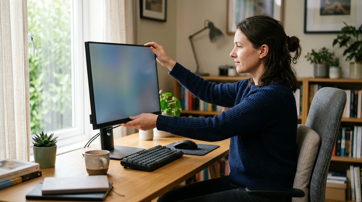
Screens are part of your daily rhythm—work, study, gaming, scrolling, creating. When monitor settings are even slightly “off,” your eyes can start working overtime. Our team built this like a quick tune-up: adjust what matters most (brightness, contrast, text size, distance, glare, color temperature), confirm with a simple comfort test, and lock in settings that feel calm and readable. The goal isn’t “perfect numbers,” but a setup that stays comfortable for long stretches—day or night.
Before you change a single setting, give your eyes the best starting conditions. These small physical tweaks often fix more discomfort than any menu option.
Once your posture, distance, and glare are handled, these settings do the heavy lifting for long-session comfort.
If you want a deeper, research-backed overview of common screen-related symptoms and prevention basics, the American Academy of Ophthalmology’s Computer Vision Syndrome guide is a solid reference.
Color temperature is where many setups go from “fine” to “finally relaxing,” especially after sunset.
For context on blue light and evening routines, Harvard Health’s summary on blue light and sleep is worth a look.
For workstation layout fundamentals (screen placement, viewing distance, and overall setup), NIOSH’s Computer Workstations guidance is a helpful baseline.
| Setting | Comfort target | Quick adjustment |
|---|---|---|
| Brightness | Screen matches room (not glowing, not dim) | Lower brightness until whites stop looking like a light source; raise slightly if text looks muddy |
| Contrast | Text stands out without harsh edges | Reduce if letters look “outlined”; increase if everything looks flat |
| Color temperature / Night mode | Softer at night, neutral by day | Increase night warmth gradually; keep enough neutrality to read comfortably |
| Scaling / Text size | Readable without leaning forward | Increase OS scaling or font size; keep native resolution |
| Position / Distance | Neck relaxed; eyes not straining | Top of screen at or slightly below eye level; start at arm’s length |
| Glare control | No bright reflections or hotspots | Rotate/tilt monitor; shift lamp/window angle; consider a matte screen setting if available |
| Refresh rate | Motion feels smooth; less “strain” during scrolling | Set highest stable refresh rate in display settings |
If you want a ready-to-use guide you can keep near your desk, our team made a simple, step-by-step digital download: The Eye-Saver’s Monitor Checklist – Fun & Easy Guide for Perfect Monitor Eye Comfort Settings. It’s designed for quick repeats—so you can re-tune when seasons change, you switch rooms, or you add a new monitor.
And if you’re building a more comfortable daily routine beyond screens, you may also like: Discover Your Strengths in the Age of Smart Tools for practical, structured reflection you can do in short sessions.
Set brightness so the screen matches your ambient light: a white page shouldn’t look like a light panel in a dim room, and it shouldn’t look gray and lifeless in a bright room. A quick test is to open a mostly white page, lower brightness until it stops “glowing,” then raise it slightly until text looks clean and easy.
Night modes can make evening viewing feel softer and less harsh, which many people find more comfortable—especially before bed. Eye strain can also come from glare, a brightness mismatch, tiny text, or long unbroken sessions, so night mode works best alongside good brightness, readable scaling, and regular breaks.
Increase font size or OS scaling first so you can keep a relaxed posture and avoid leaning forward. Start at about an arm’s length from the screen and adjust slightly based on how effortlessly you can read without tightening your neck or squinting.





Leave a comment