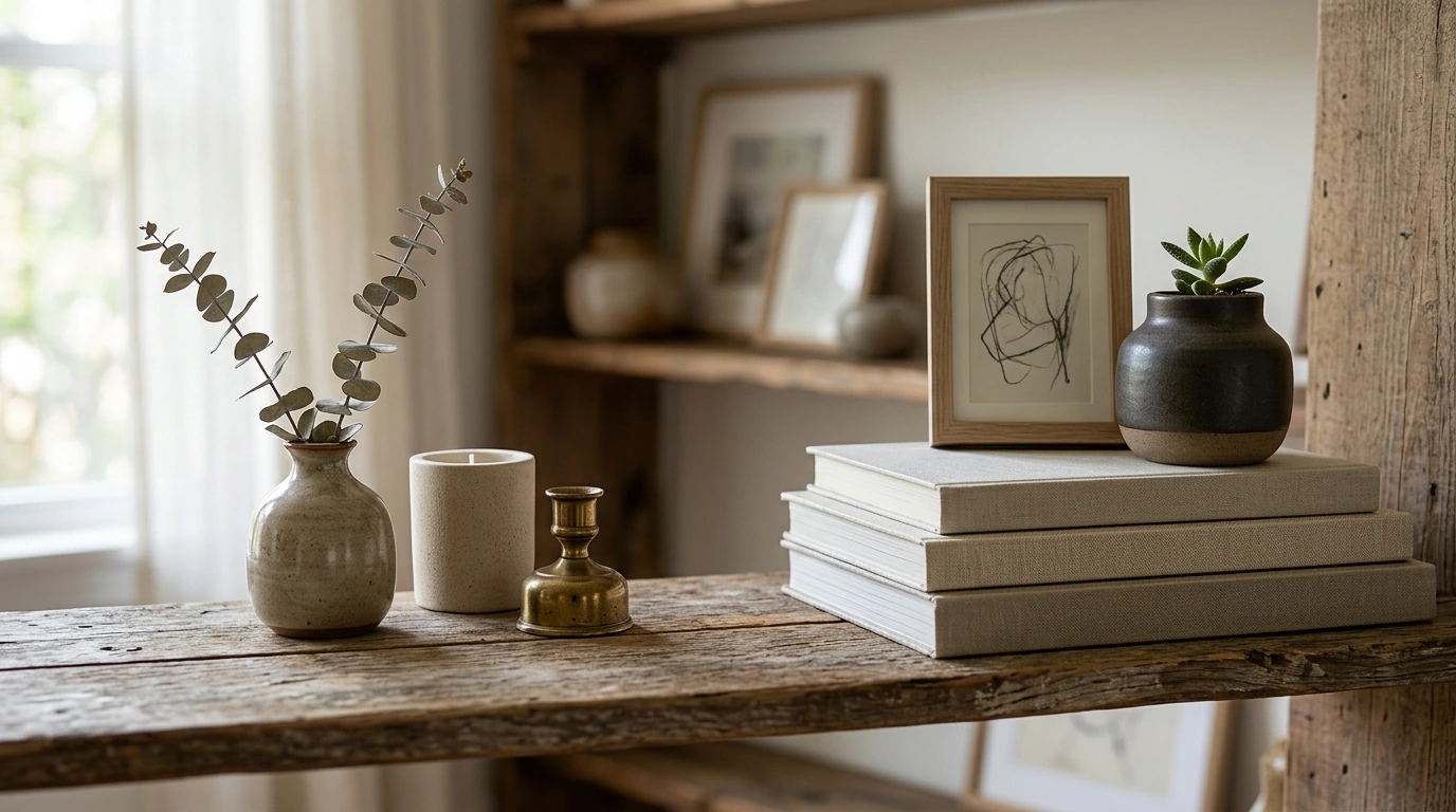
The 3-5-7 rule is a simple styling framework that helps you build a display that feels intentional, balanced, and easy on the eye. You group decor items in sets of 3, 5, or 7—often as vignettes on a console table, coffee table, mantel, shelving, or nightstand. Odd numbers tend to look more natural than even numbers, and they create a pleasing rhythm without feeling overly “matched.”
When you style with 3, 5, or 7 pieces, you can create a clear focal point while still layering supporting accents. Our team uses this rule to prevent two common decorating issues: sparse surfaces that feel unfinished and crowded arrangements that feel noisy. The rule is flexible—your “items” can be objects, books, framed art, or even a plant counted as one component.
Three is ideal for smaller surfaces and modern spaces. A reliable trio is: a tall anchor (lamp or vase), a medium element (frame or sculptural object), and a low element (box, candle, or small bowl). Keep heights varied and cluster pieces close enough to read as one moment, not three scattered items.
Five works well on coffee tables and wider consoles. Start with a tray to corral the group, then build a mix of heights and textures: books, a candle, a small bowl, a vase, and a decorative object. This count gives you room to add warmth—metal, glass, ceramic, and wood—without losing order.
Seven is best for shelves, long mantels, or built-ins where repetition feels intentional. Use a consistent thread (color family, material, or shape) and vary scale. To keep it airy, combine “visual rest” pieces (like stacked books) with standout accents (like a sculptural vase or statement frame).
Use one hero item, repeat one finish twice (such as brass), and include at least one softening element (textile, greenery, or a matte ceramic). If you’re building a full-room plan, our team also recommends working through a cohesive checklist—start here: Luxury Interior Design Checklist (Modern Glam to Minimal).
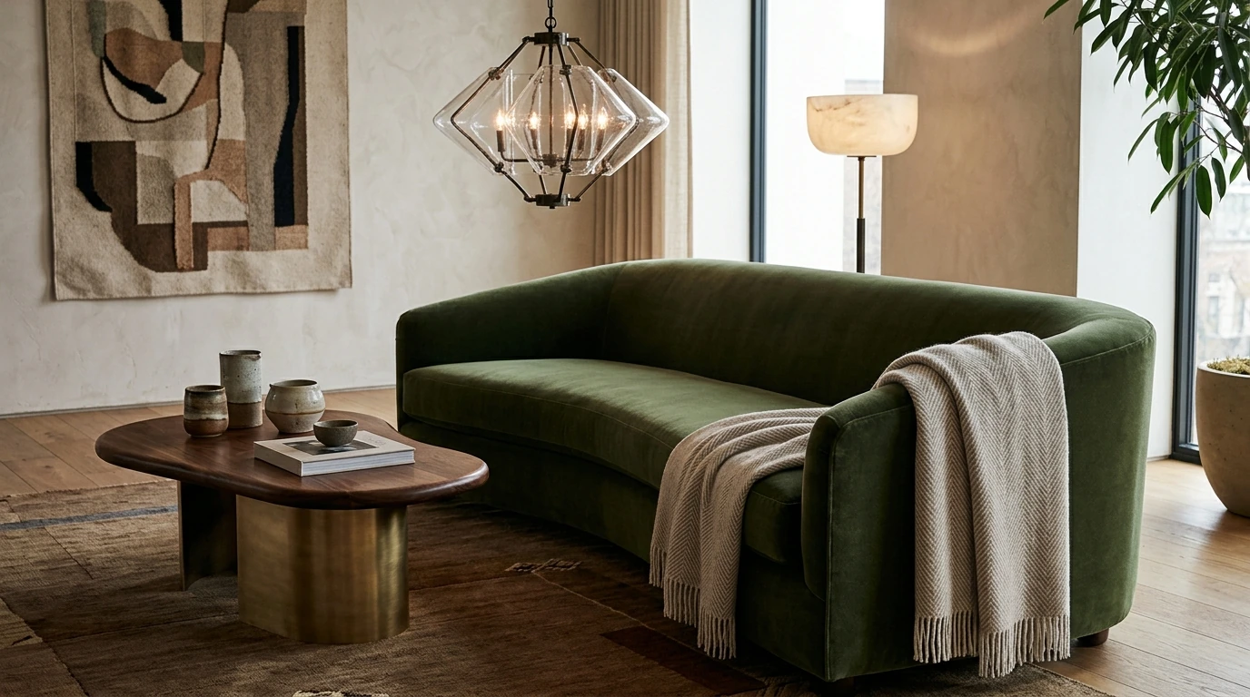
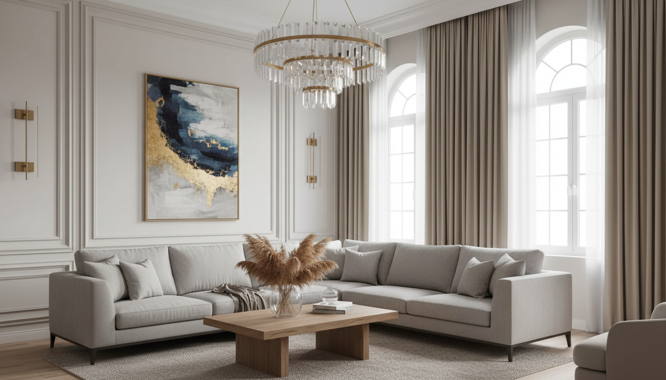
Pick one dominant neutral, one supporting color, and one accent finish, then repeat each at least twice around the room. This keeps the look unified while still giving you contrast.





Leave a comment