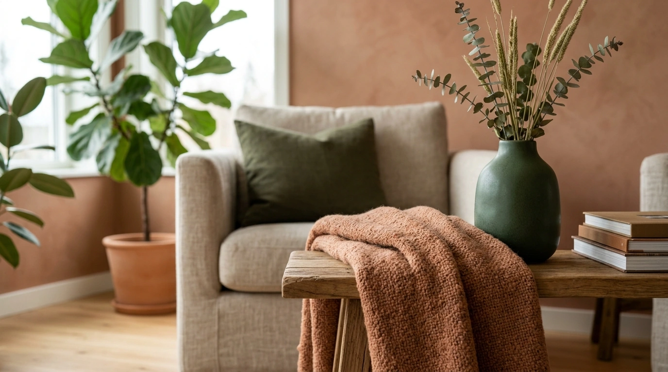
For 2026 living rooms, the “in-colour” direction is less about one single shade and more about a refined, livable palette: grounded earth tones, warmed-up neutrals, and a few saturated accents that feel tailored rather than trendy. Our team is seeing clients gravitate toward color that reads calm in daylight, cozy at night, and sophisticated next to mixed materials like stone, wood, metal, and textured fabrics.
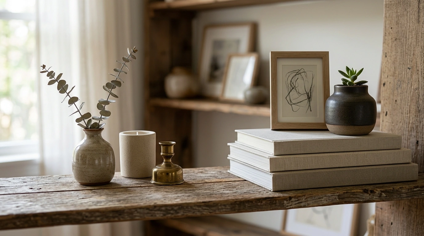
Warm neutrals (the new base layer): Creamy off-whites, linen beige, oatmeal, and soft camel are replacing stark cool grays. These shades make rooms feel brighter while still looking expensive, especially in matte or eggshell finishes.
Earthy clay and terracotta: Muted terracotta, cinnamon, and clay blush add warmth without overwhelming the space. They’re especially effective on an accent wall, built-ins, or even just through rugs and pillows if you want a lighter commitment.
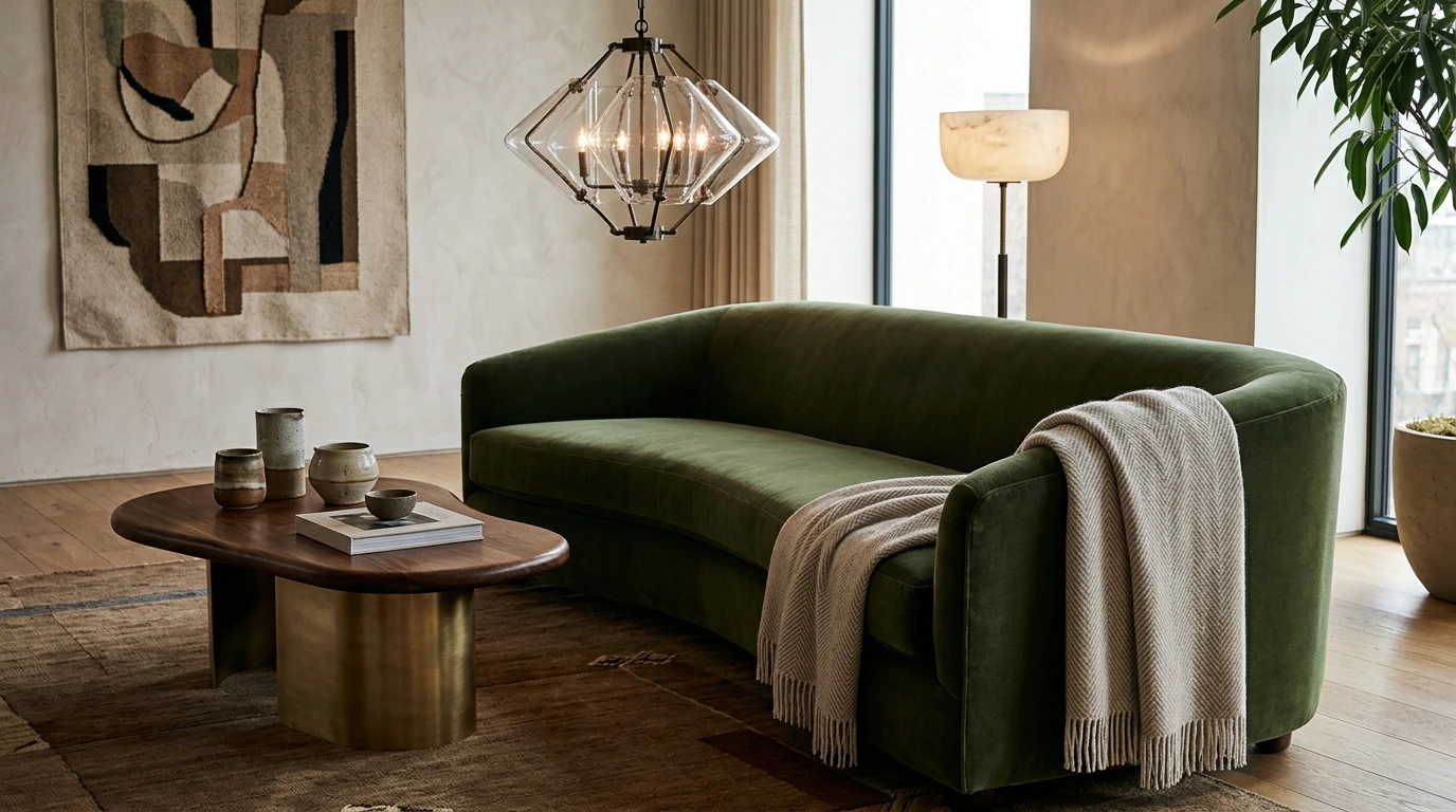
Nature greens: Olive, moss, and eucalyptus green are strong for 2026 because they pair easily with walnut woods, antique brass, and natural stone. Use green on cabinetry, a statement sofa, or drapery to get impact without making the room feel dark.
Deep blue-green accents: Tones like teal, petrol, and inky blue bring a polished, modern edge. We like these for a velvet chair, a lacquered side table, or a painted fireplace surround.
Start with one warm neutral on the walls, then add one earth tone (clay or green) and one darker anchor (teal or charcoal) through upholstery and casegoods. Balance the palette with texture—bouclé, mohair, linen, and natural-fiber rugs—so the room feels layered instead of busy.
For more step-by-step guidance on pulling the whole look together, you can also use our luxury interior design checklist here: https://classicalle.com/guide-luxury-interior-design-checklist-modern-glam-to-minimal/.
Warm neutrals, earthy clay tones, olive-based greens, and deep blue-green accents are leading choices. The overall trend is softer, natural color that still looks tailored when paired with rich textures and mixed finishes.
Instead of one universal “color of the year” that fits every home, 2026 interiors are favoring warm, nature-inspired shades that feel timeless. If you want one dependable direction, start with a creamy warm neutral and build from there.
The in-colour direction for 2026 interiors centers on warmed-up neutrals, grounded earth tones, and a few sophisticated saturated accents like teal or olive. These shades work across styles and help spaces feel inviting, elevated, and easy to live with.


Leave a comment